Calculates the risk-adjusted sequential probability ratio test for a series of procedures which can be used to create CUSUM charts.
Arguments
- xi
An integer. The dichotomous outcome variable (1 = Failure, 0 = Success) for the i-th procedure.
- p0
A double. The individual acceptable event rate for each individual procedure (adjusted).
- OR
A double. An odds-ratio reflecting the increase in relative risk of failure.
- by
A factor. Optional variable to stratify procedures by.
- alpha
A double. The Type I Error rate. Probability of rejecting the null hypothesis when `p0` is true.
- beta
A double. The Type II Error rate. Probability of failing to reject null hypothesis when it is false.
References
Rogers, C. A., Reeves, B. C., Caputo, M., Ganesh, J. S., Bonser, R. S., & Angelini, G. D. (2004). Control chart methods for monitoring cardiac surgical performance and their interpretation. The Journal of Thoracic and Cardiovascular Surgery, 128(6), 811-819.
Examples
library(purrr)
library(ggplot2)
# Data
df <- data.frame(
xi = simplify(
map(
c(.1,.08,.05,.1,.13,.14,.14,.09,.25),
~ rbinom(50,1,.x))),
p0 = simplify(
map(
c(.1,.1,.1,.1,.1,.1,.1,.15,.2),
~ rnorm(50,.x,.03))),
by = rep(
factor(paste('Subject', c('A','B','C'))),
times = c(150,150,150))
)
# Create CUSUM plot
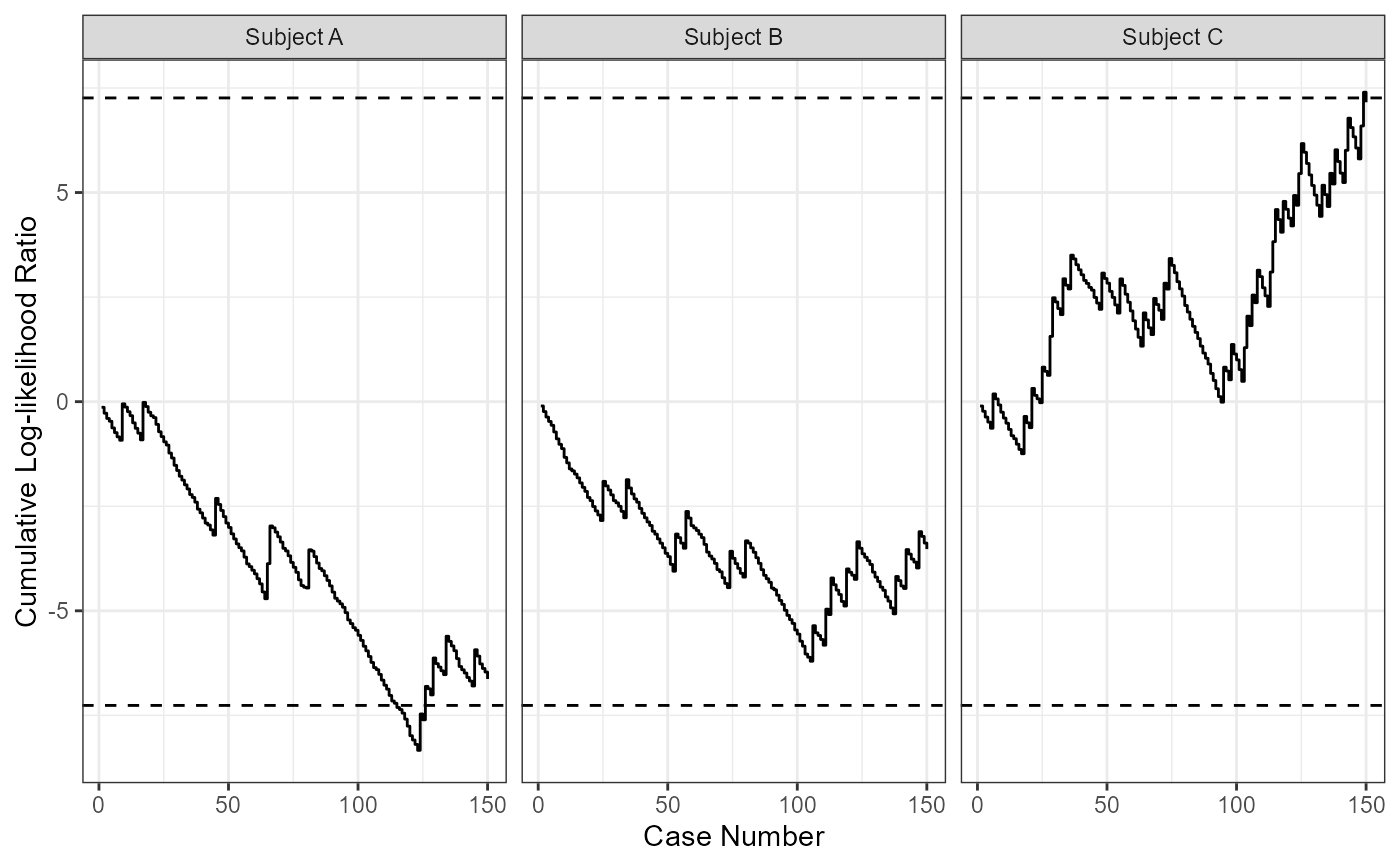
cusum_sprt(
xi = df$xi,
p0 = df$p0,
OR = 1.5,
by = df$by
) |>
ggplot(aes(y = cusum, x = i)) +
geom_step() +
geom_hline(aes(yintercept = h0), linetype = 2) +
geom_hline(aes(yintercept = h1), linetype = 2) +
ylab("Cumulative Log-likelihood Ratio") +
xlab("Case Number") +
facet_wrap(~ by) +
theme_bw()